
Food Network Kitchen - Discovery
Description
We recently launched the all-new Food Network Kitchen app, a 360-degree cooking experience that brings together Food Network’s incredible content, recipes and the world’s top chefs, right to your own kitchen.
ROLE
Product Designer(UX)
TEAM
Design Director, myself, Product designers(visuals), Researcher, Analytics, Marketing and CMS Team.
Process
Information Architecture > Analytics > Customer feedback Review >
Research > Wireframe > VISUAL DESIGN > PROTOTYPE > TEST > ITERATE > RETROSPECT

Information Architecture
My role
At this time in the team myself and design director are the only two who focus on the UX. which would involve discussing a feature or new change with product managers, owners, UX researchers, engineers and design director for initial feedback.
Artifacts from my end includes - information architecture, user flows, user journeys, wireframes ( low- fidelity ) explorations, prototyping along with competitive analysis/ market research and present to our stakeholders to make more informed decision.
Visually making it in a high fidelity is taken care of by other visual designers
Problem Summary
Current navigation is Explore, Recipes, Classes, Shows, and Profile. Secondary navigation at the top of the explore page is flexible and extensible, but only presents 3 items without swiping. How might we update our UI/UX to support future navigation items?
Challenges
Building Discovery’s first direct to consumer(DTC) product experience.
The design had to be cohesive for Web, iOS, Android, Amazon Fire TV.
Customers couldn’t find features which was previously accessible very easily like Saves.
Initially, there was uncertainty regarding some of the requirements and capabilities, so designs had to be made with assumptions, then tweaked as we got new information from other internal and external teams.
DESIGNS
There are different parts to the App like Landing pages, Upsell ,Onboarding, Search, Card styles, Navigation, Live classes, Recipes, Shows, courses, cook along, profile etc.
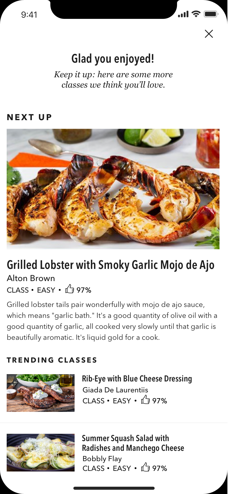
Below is the visuals of our most popular feature - LIVE CLASSES / Q&A.
IOS


Android
Amazon - Fire TV
METRICS
Customer Satisfaction:
NPS, Mobile App Store Reviews, Mobile App Store Ratings
Product & Tech Performance:
Page Load Rate, Video Start, Crash Free Sessions
Revenue:
App Install to Trial, Time to first action, Subscription Drivers, Ad revenue
Marketing:
ROI per Channel, Subscription Conversion Rate per Channel
CONCLUSION
Few of the lessons we learnt is customers are constantly changing. For eg: The current navigation was preferred by customers during a previous test. However, post-launch customer feedback shows a lack of understanding of what features are available within the app. So it’s important to do both quantitative and qualitative research based on the concept we are testing. For me as a UX designer, design is a team sport and always an iterative process which involves customer centric approach.